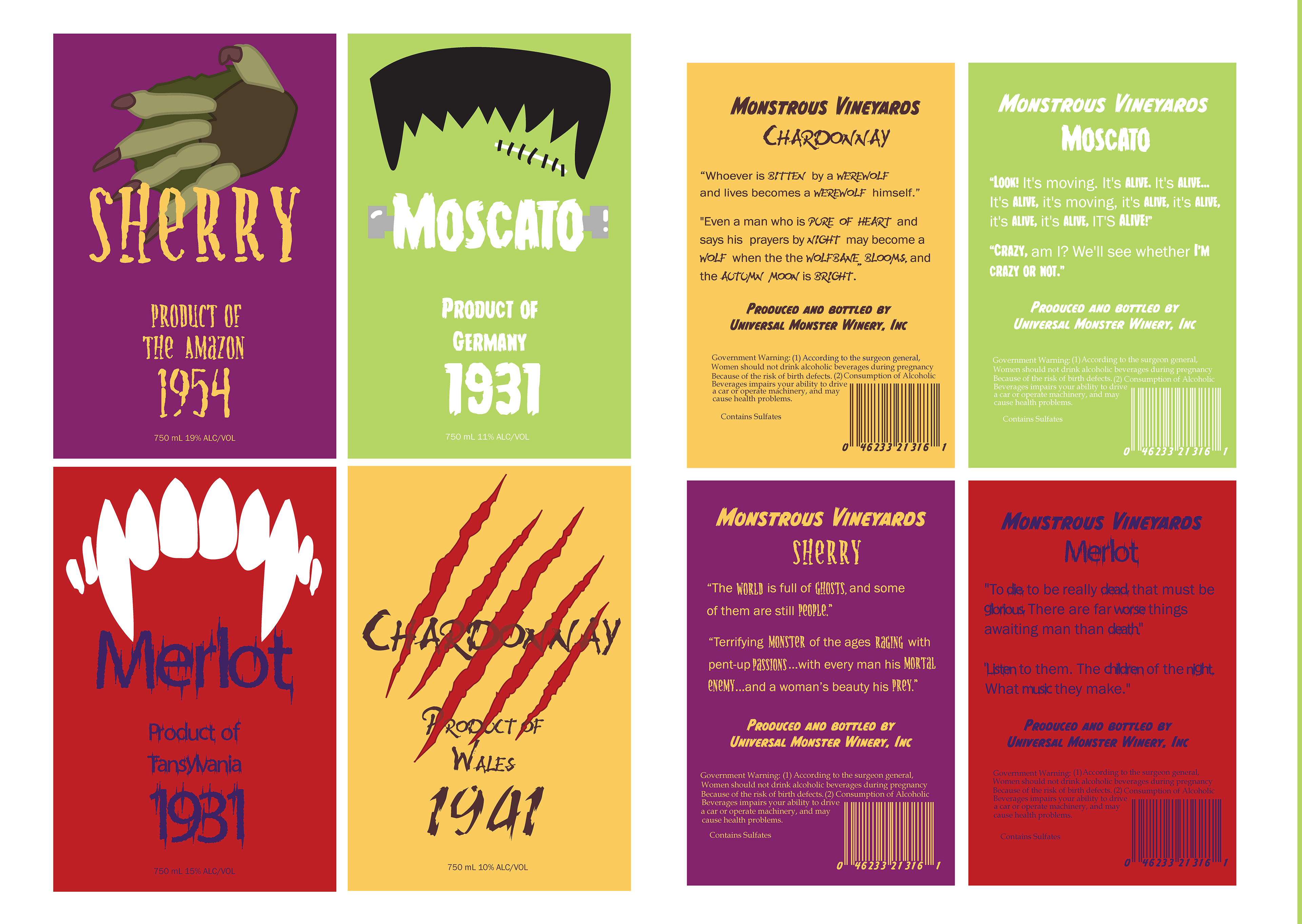
The bottle labels are filled with small details that exemplify the niche audience of classic horror movie fans that this brand hopes to cater to. The font for the brand is called "monster mash" and for each bottle, Dracula's font is "frisky vampire", the Wolfman's font is "werewolf moon", the Creature from the Black Lagoon's font is "creature", and Frakenstien's Monster's font is called "Frakenstien's Monster". Each symbol is representative of the monster and the colors are meant to go with the aesthetic of each monster while following color conventions of typical wine types. The regions are each a product of where the monster's movie takes place. The year is when the movie came out and the alcohol percentage is the minutes over an hour each movie is. The back of the labels contains just as much detail as the front, with quotes from the movies shown, and the barcode is the numerical value of the main universal monster's first letter of their first name.
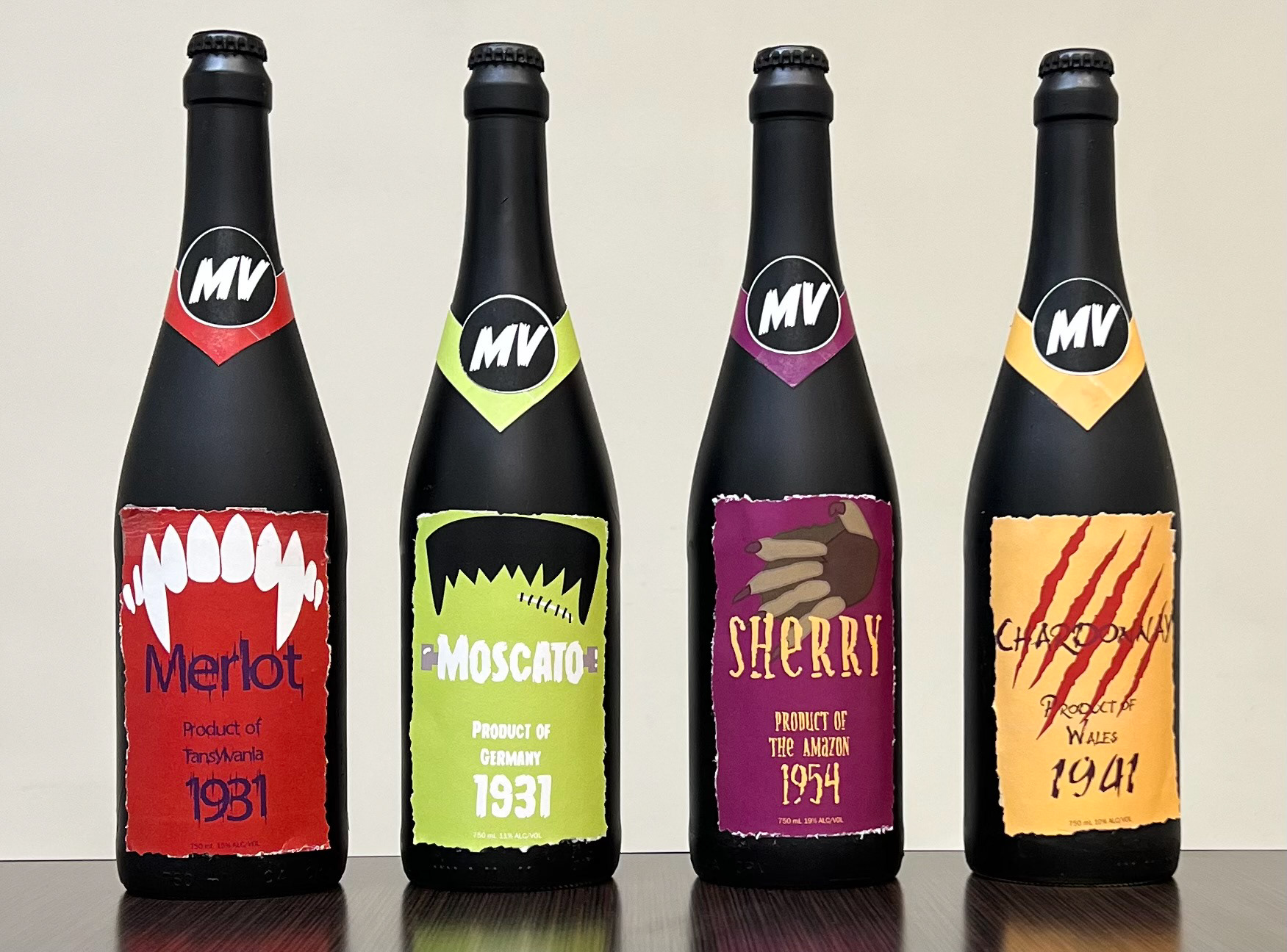
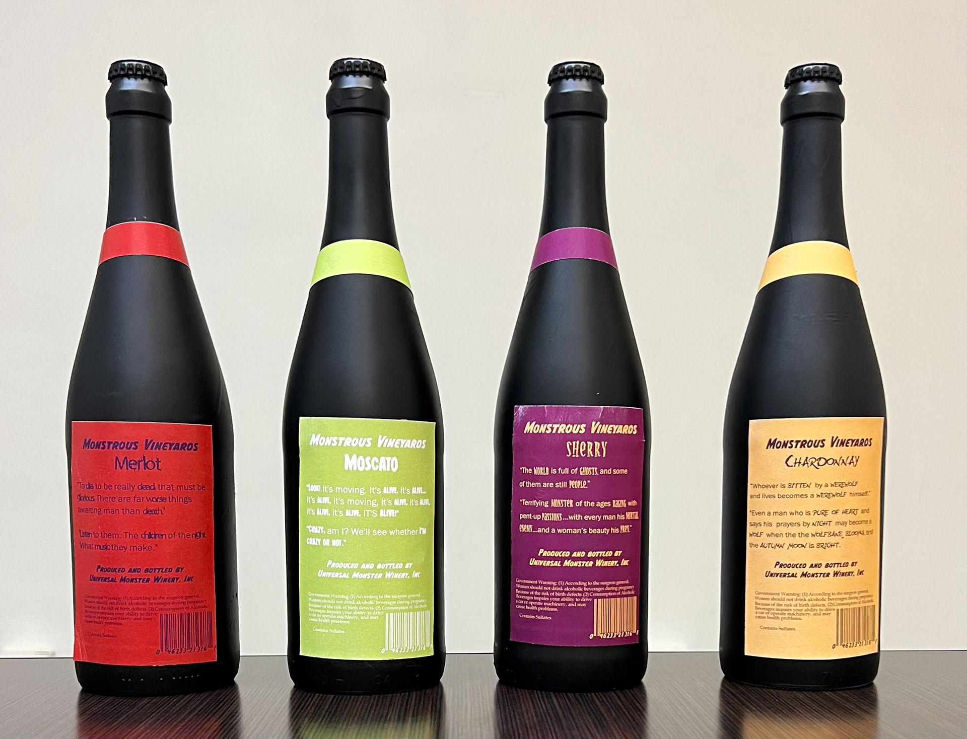
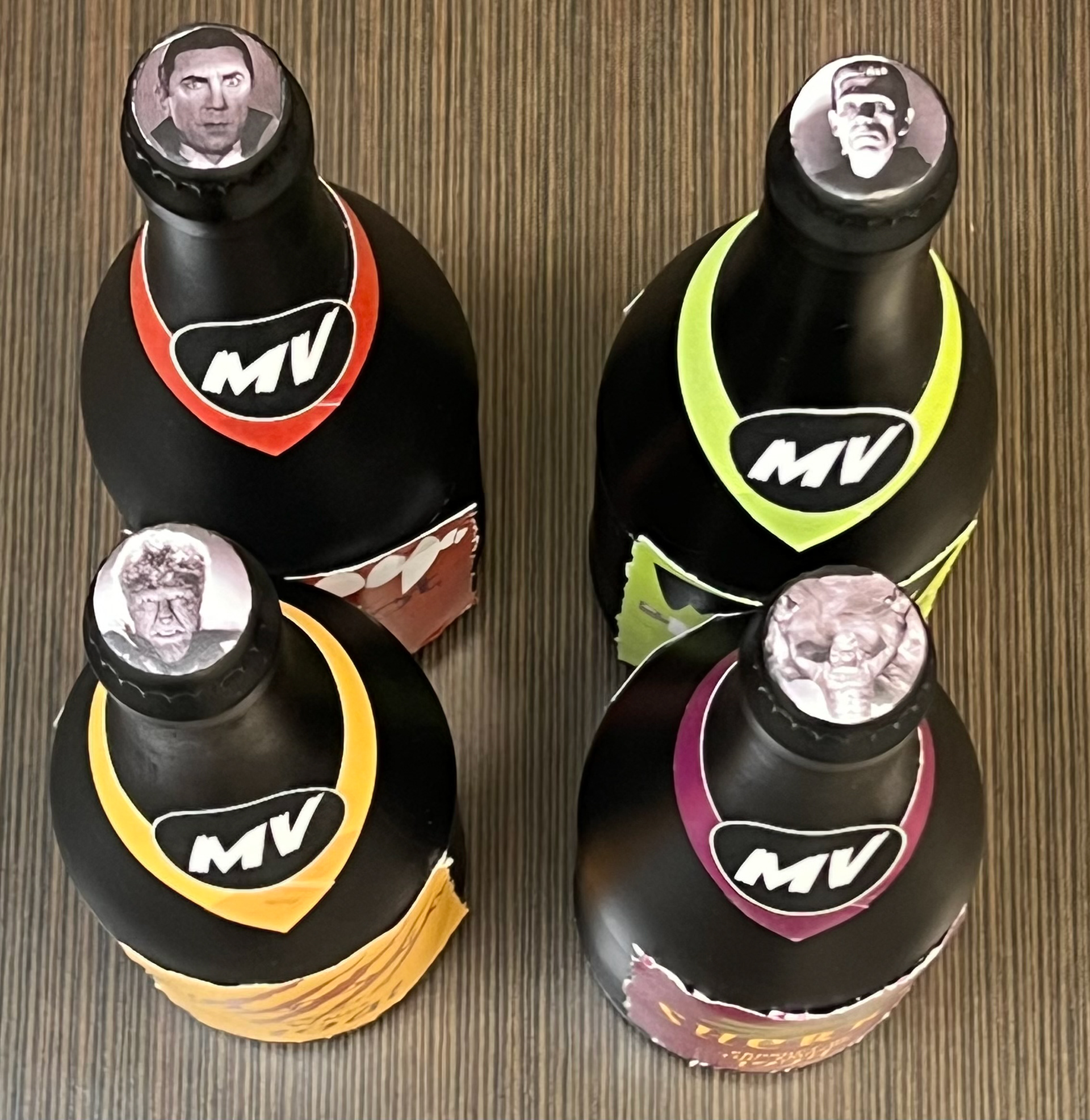
These are glam shots of the actual bottles made, each one spray-painted black to allow the colors of the labels to pop. The logo of the winery, "Monstrous Vineyards," holds together the ribbon on each, and the bottle caps show off the real movie monster each bottle represents. Also, the labels aren't clean-cut to give a better look into the brand identity and to allow the consumer to know that this isn't your typical wine brand.